Welcome to the new business name/logo/website Conexus Counselling…home of the same therapists and same quality counselling our community has trusted and counted on for the last decade.
We are now Conexus Counselling…and for a time, we’ll tag on the “formerly known as Bergen and Associates Counselling” onto the end to give folks a chance to get used to us.
Conexus is latin for connections.
Conexus is about being connected, linked, or fastened. Our therapy understands profoundly that we are wired for connection…that is how are brains are created. We have better immunity, heart health, psychological health and live longer when we are in meaningful connection with each other.
Clients come to us when there are barriers that interfere with the connections they long for with their partner, child, parent, or friend. Some clients come and work on the connection they have with parts of themselves that they have been distancing from or ignoring…and their mental health/depression/anxiety improves. Other clients come to explore their relationship including connecting with something beyond themselves…a spiritual connection.
It made sense for us to have a name that acknowledges what we have come to know as so vital to life: relationships of all kinds–Connections.
Our name was developed together as a Conexus team. Our logo was developed together. The look of this website was developed, you guessed it: together.
Conexus=Connections

The first logo was developed on my kitchen table all by myself while the Junior Tribe Members were napping. A friend who was a graphics designer created it on his computer from my drawings and we were done.
A little lot different this time around. I sent out requests to a variety of designers around the world and a designer from Indonesia, Sumbung, produced something that we liked fairly well. I narrowed the potential designs down by sending out samples of potential logos in an electronic poll to our therapists and some friends and family. A large group of us put our heads together to put together something most of us loved, and all could live with.
It was a collaboration by community.
The new logo fits with our new name and very much with who we are–it was developed in community, with all the folks at our office contributing their thoughts and ideas.
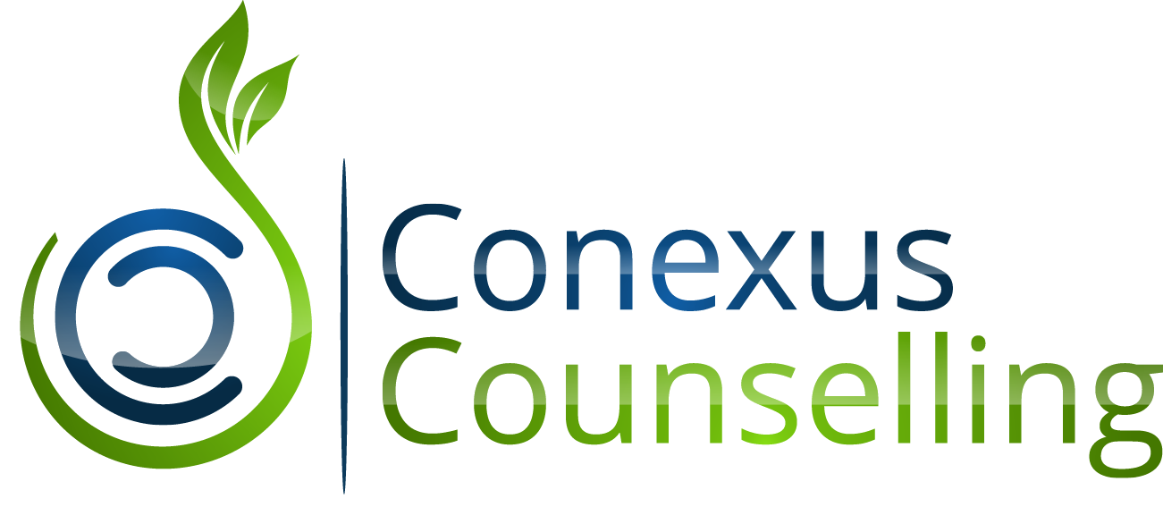
It’s related to our old design…the idea of circles symbolizing wholeness, and leaves sprouting from a seed. We wanted to connect with our history, because we have arrived where we are now because of who we have been.
The two C’s in the centre…one enfolding the other. Conexus Counselling. They face each other. in relationship–bravely and boldly. Closely with intimacy. Vulnerably. In blue…blue is the color of serenity and trust. Blue invites people in. That fits.
The C’s are supported and enveloped, but not encased, by the green seedlike curve that erupts into leaves. People often come to us in the darkness of life, when they are feeling overwhelmed with what life is throwing at them…and feeling dumped on–not unlike the seeds I planted yesterday in the garden and promptly watered. And clients so often have this time of unprecedented growth, as they face their story with a therapist to guide them. So green…the color of organic, natural growth.
You’ll notice some color variations in the greens and the blues…there are curving reflections in this logo. Life isn’t static…and therapy is about movement and reflecting, and going somewhere even when externally things might not look so very different.
We're excited to be Conexus Counselling (formerly known as Bergen and Associates Counselling). Share on XRaise a glass and toast us?


Write a Comment